About the Project
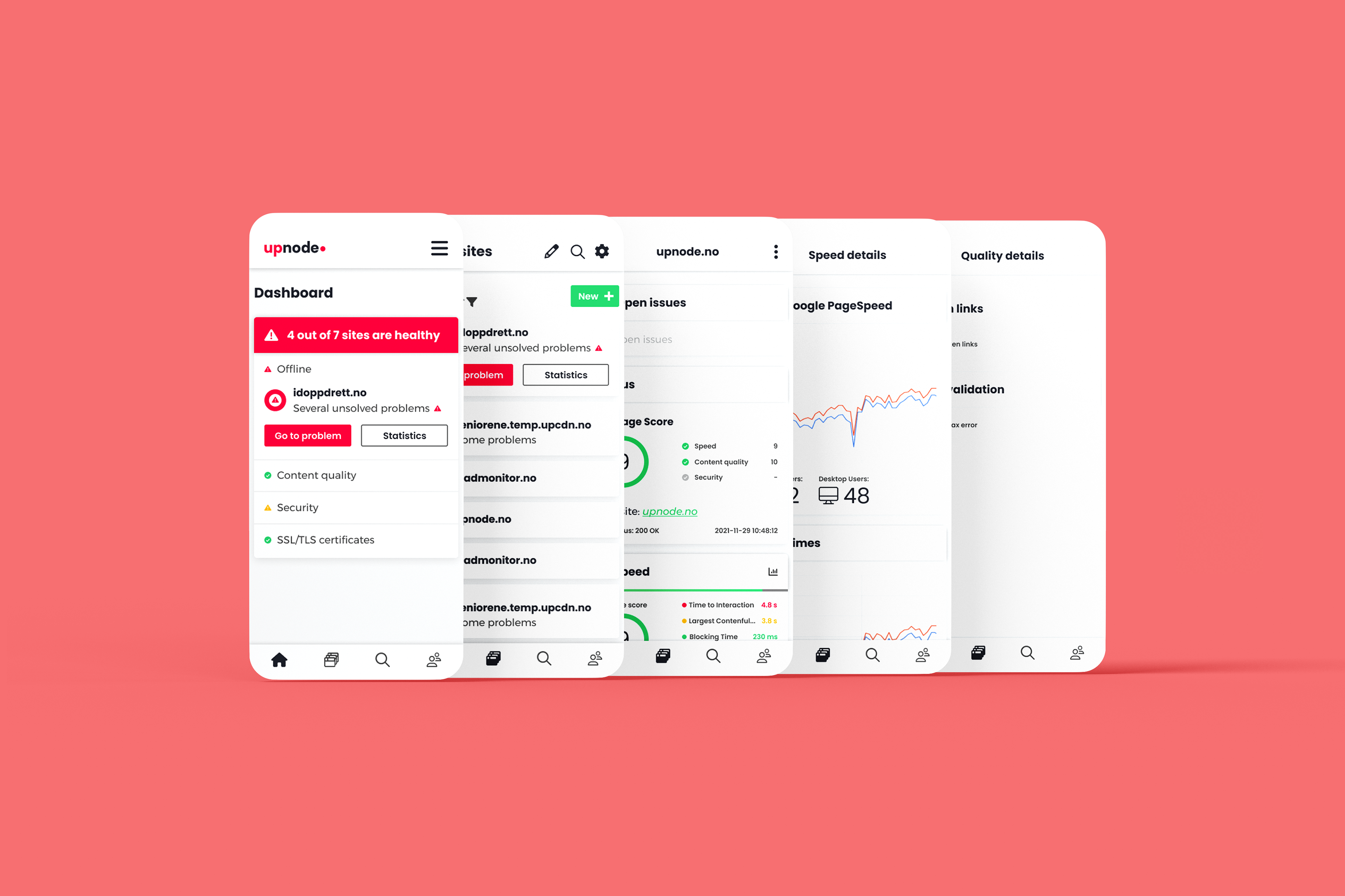
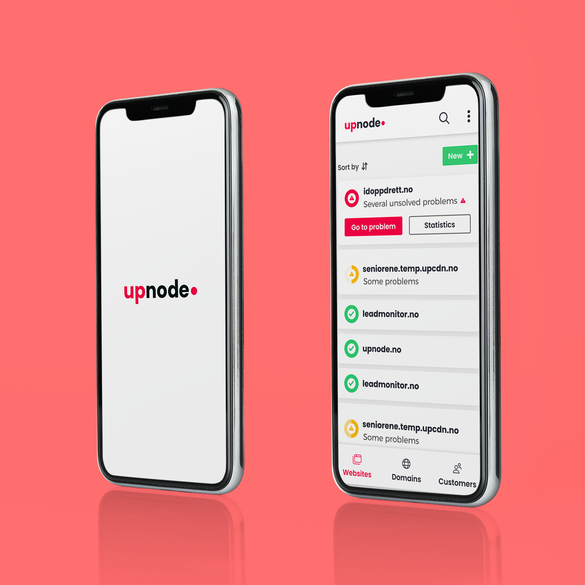
Upnode has recently decided to redesign their brand, and website application. An application where customers can receive in-depth statistics on aspects such as speed, quality and security for their website(s).
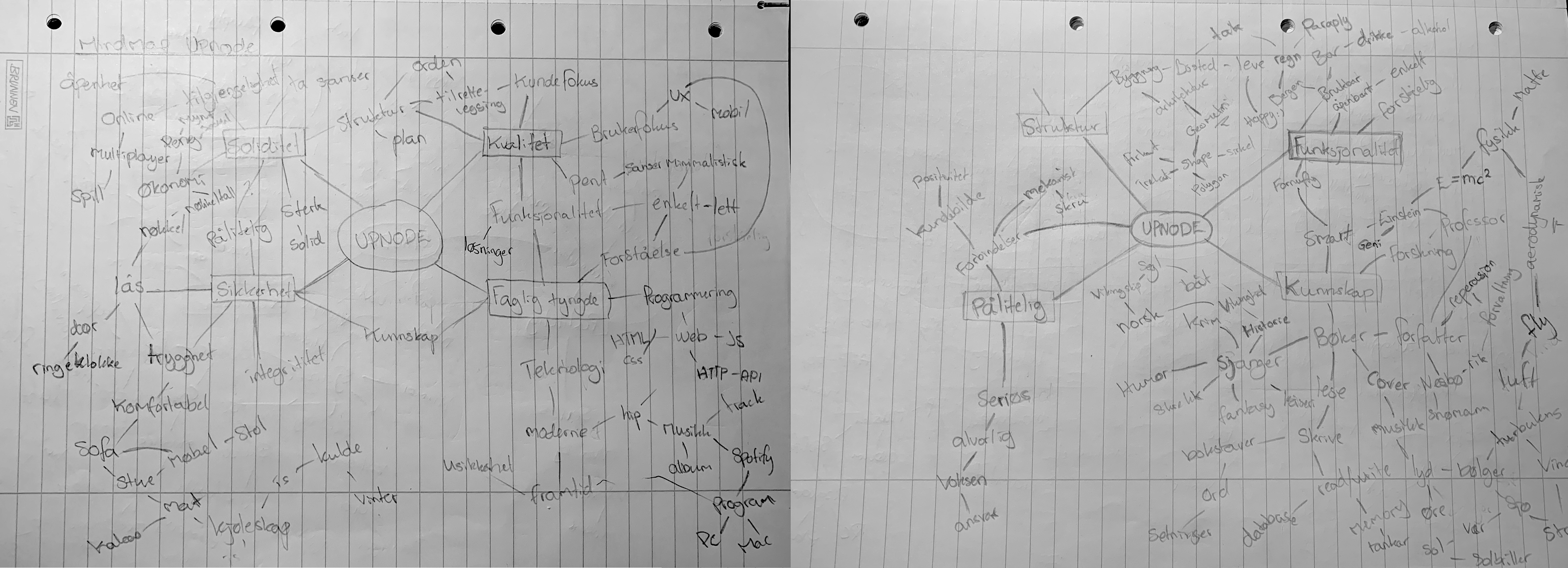
Mind-maps
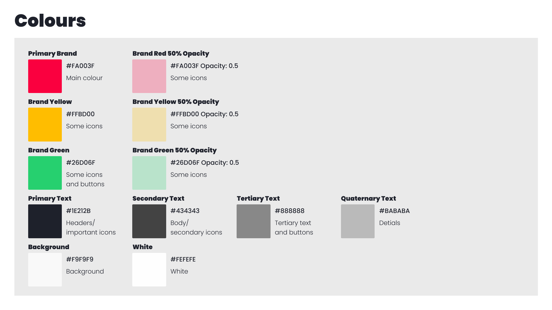
The Brand
With Upnode shifting its focus to favour implantation of new technology and backend services, it was important that the brand also reflected this. Keywords being security, quality, solidarity and professionalism.
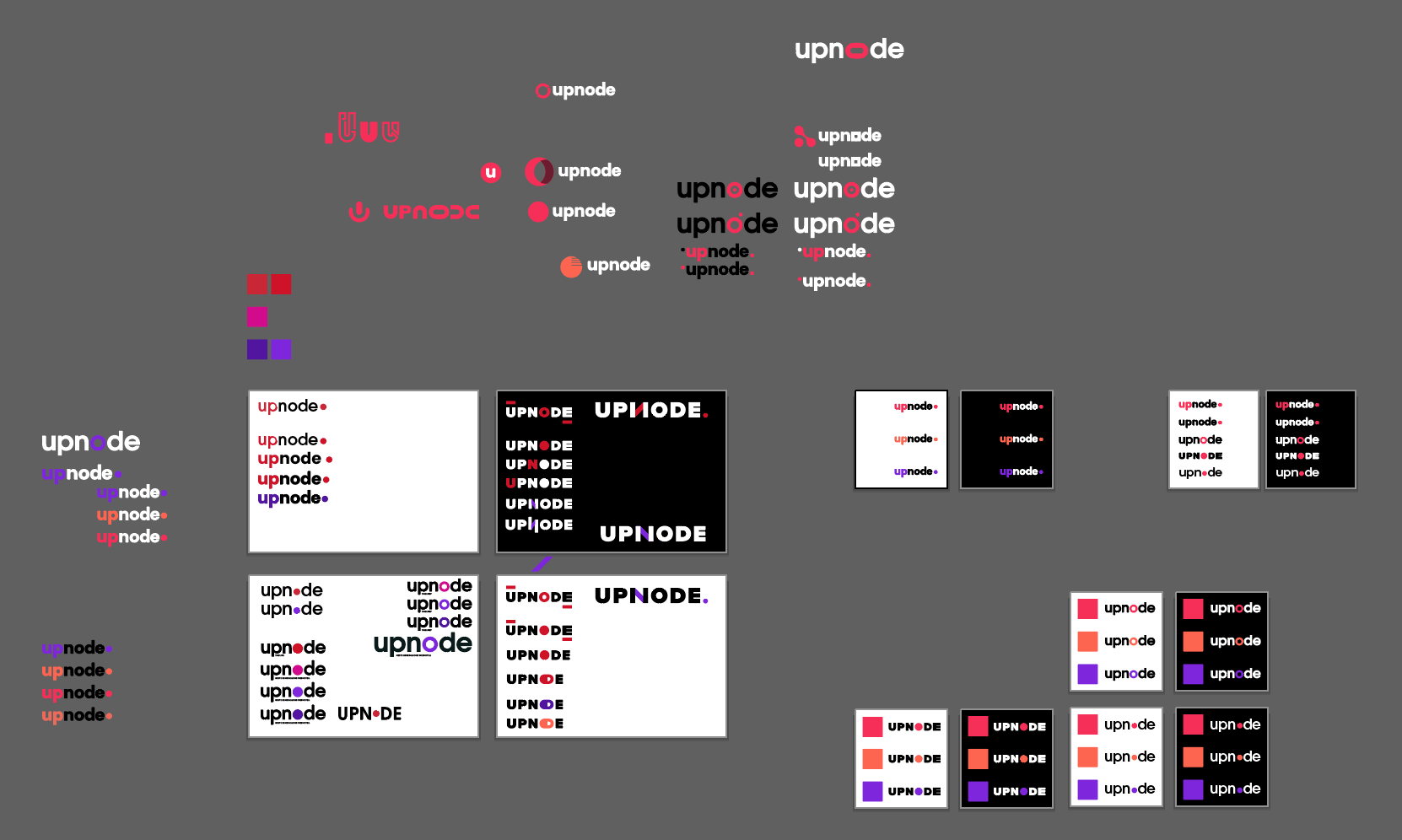
Logo process
Design System
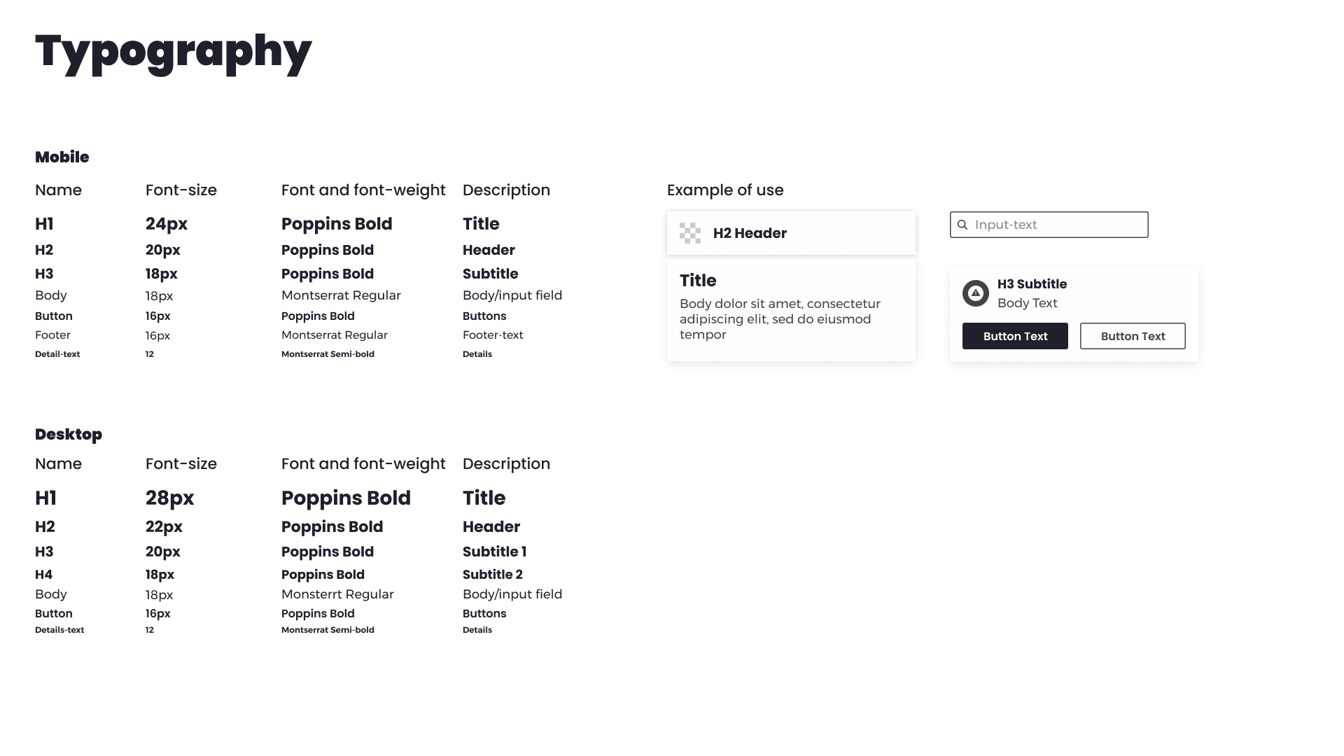
With logo, colours, and overall theme done. I created a design system for our developers to follow, including everything from border-radius and drop-shadows on cards, to logo-size and typography for the final product.
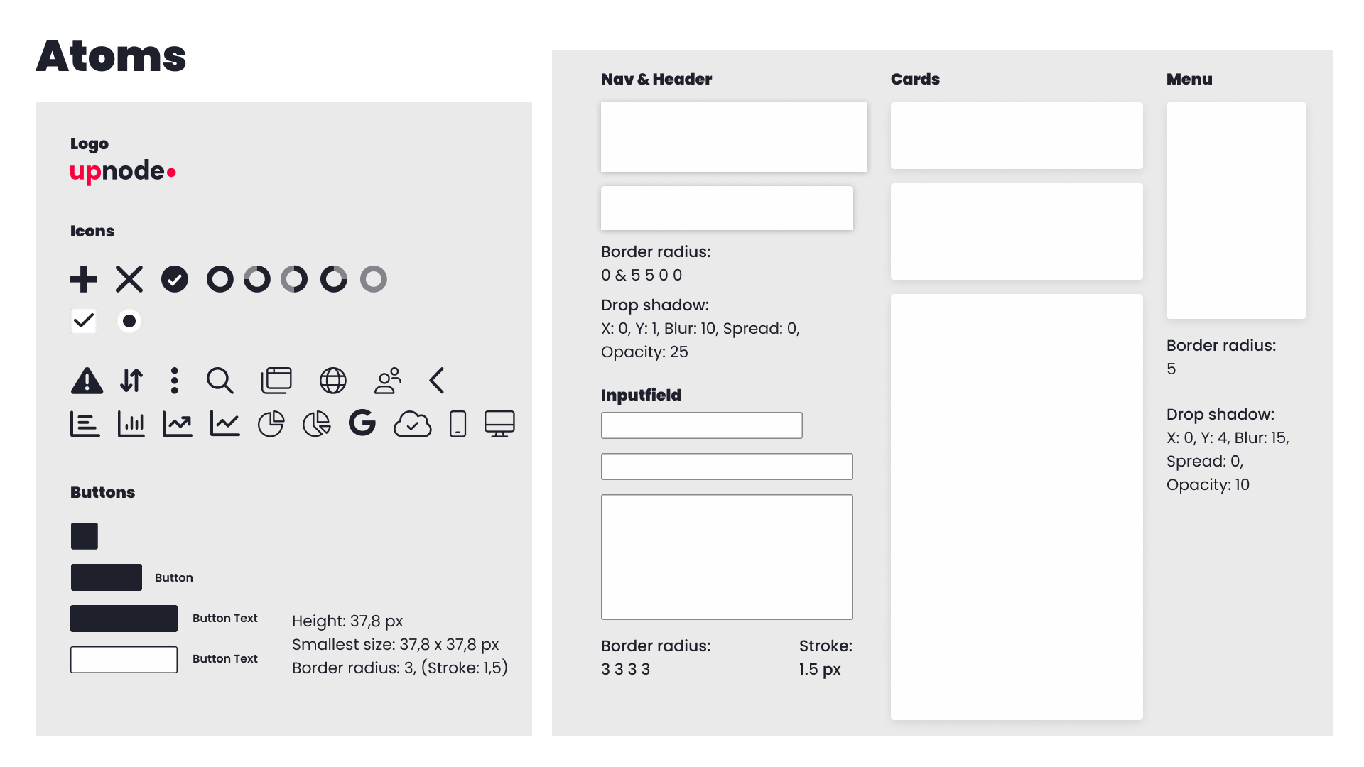
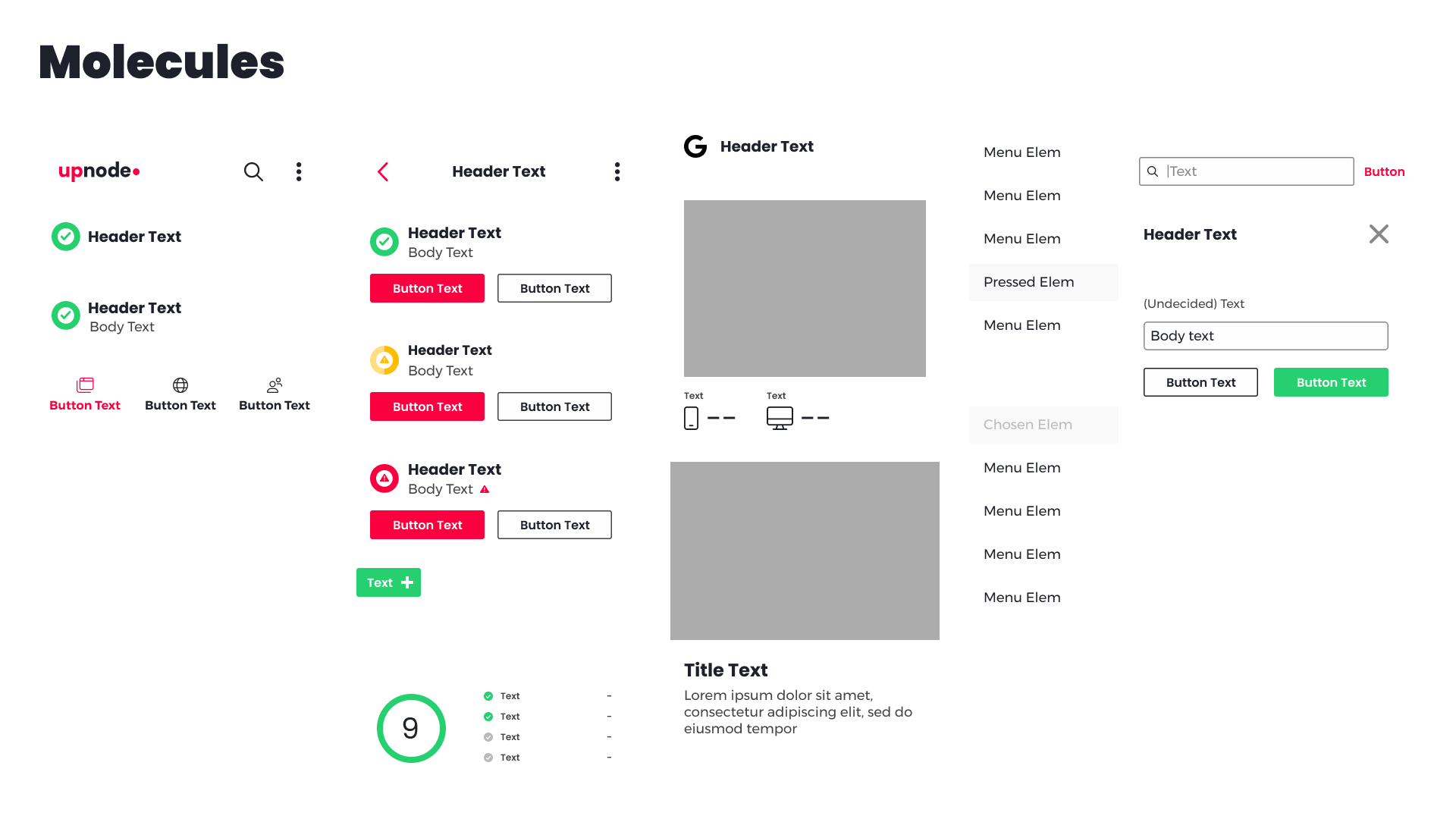
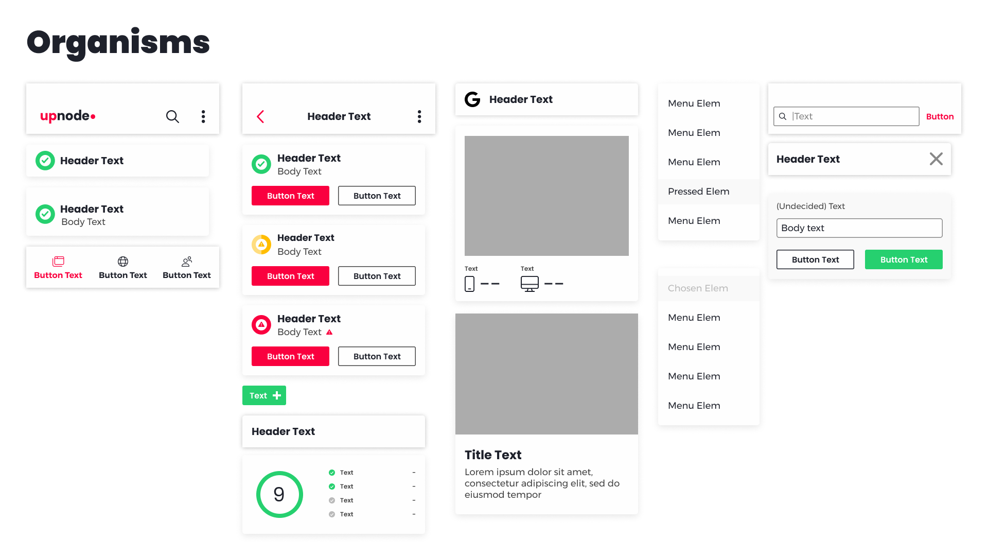
Atomic Design System
UX Challenges
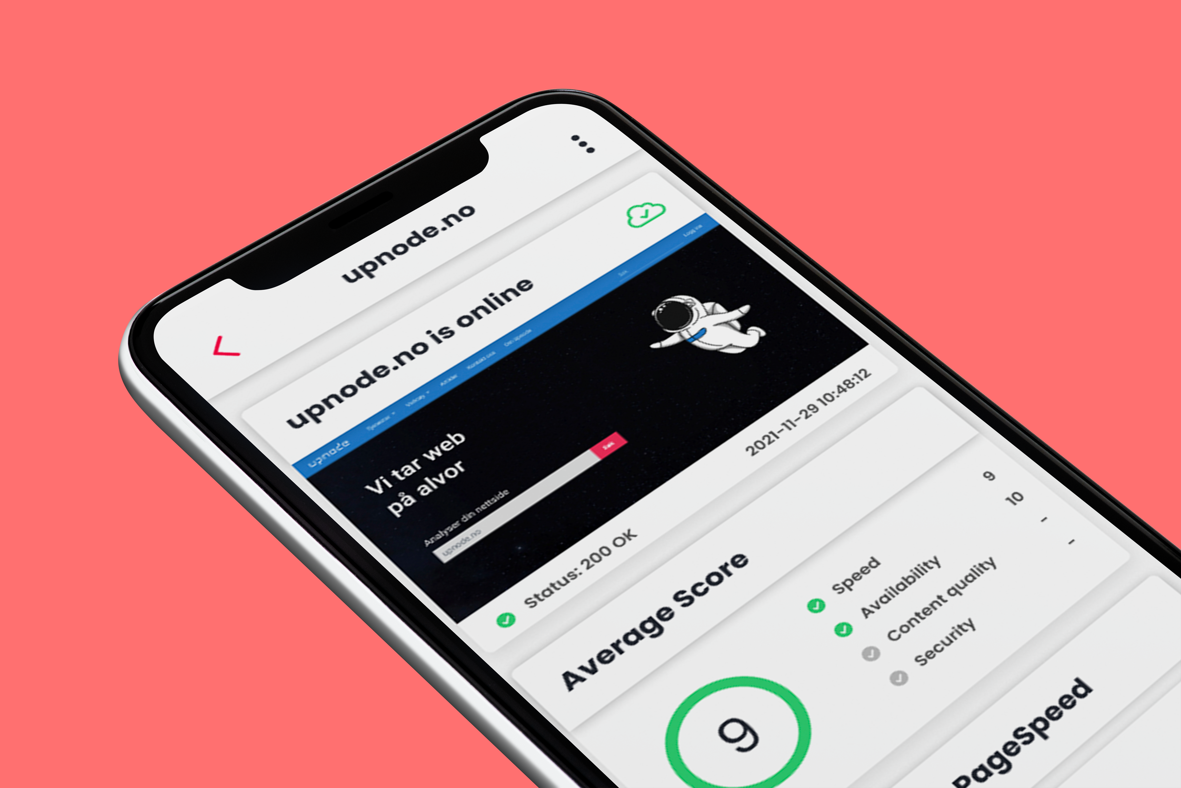
The application is web-based, but with our focus on mobile first, it was important to create a design that works on mobile.
The main challenge that arose with this project was how to create a design and layout that in addition to conveying a lot of information also would be easy to understand for all users. One of these challenges became apparent on how users would navigate the application, which required multiple rounds of prototyping and revisions.
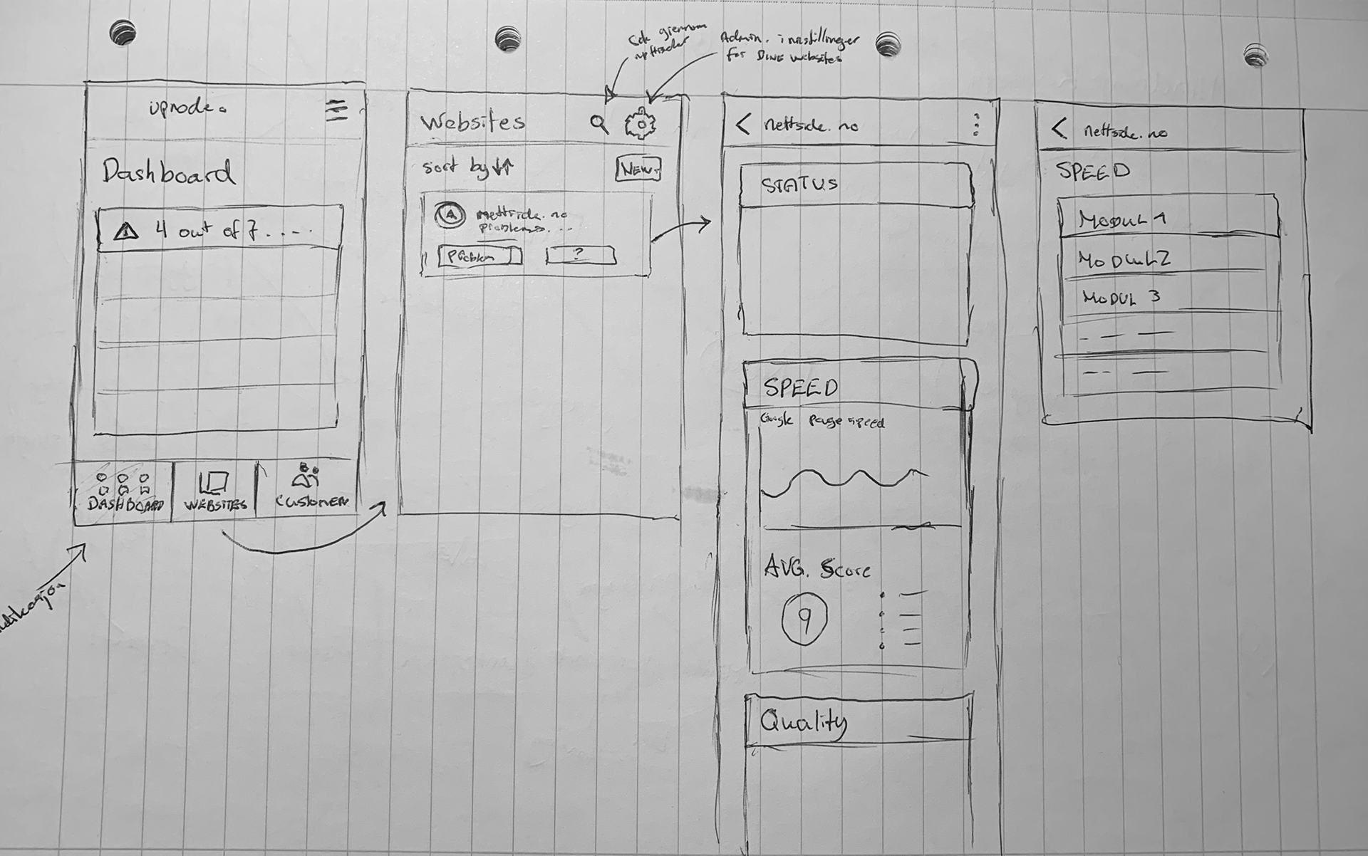
Sketches
Wireframes
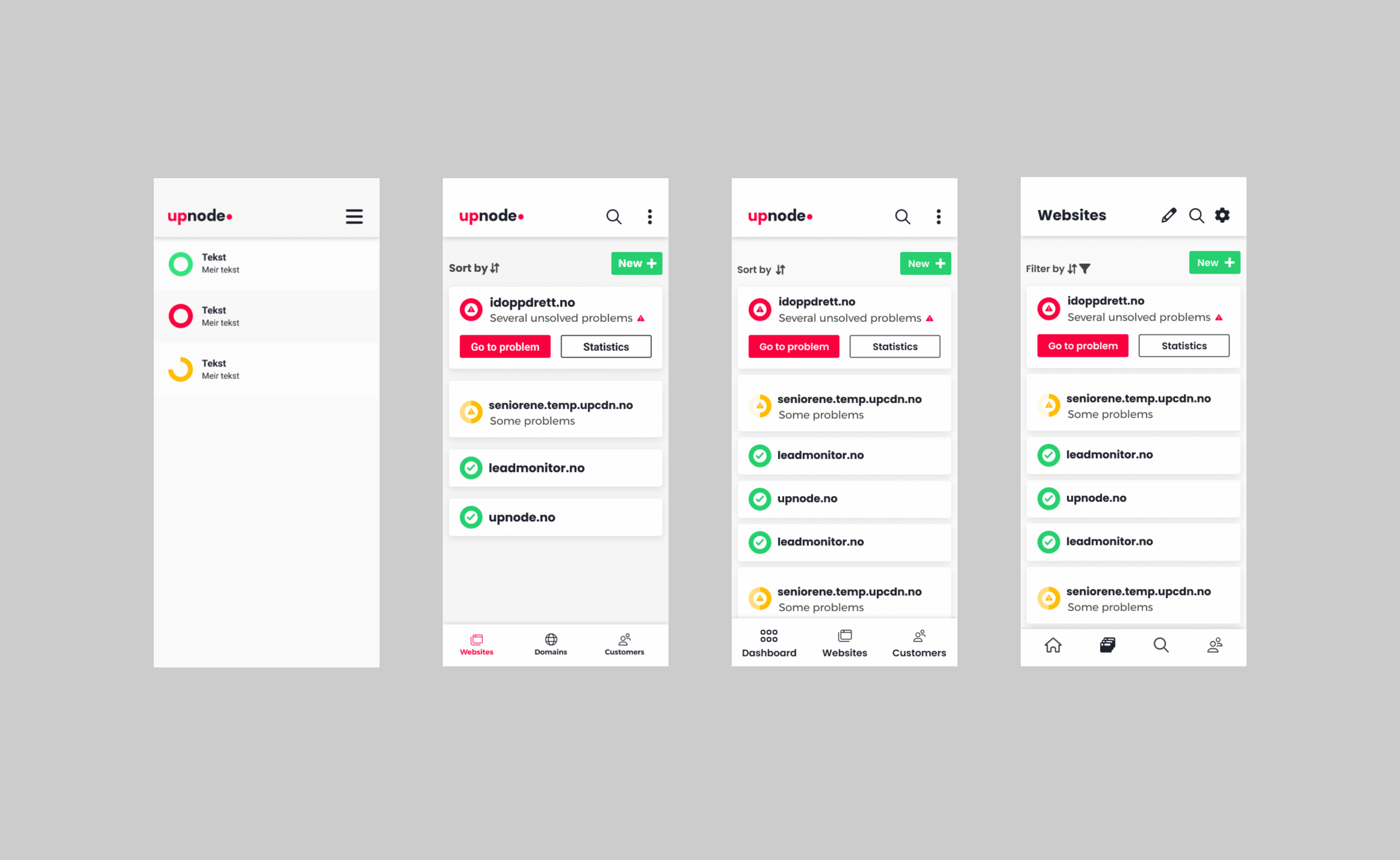
UX Solutions
To combat the amount of information and its delivery, we chose to focus on core functions and a dashboard overview of the most important information. We also implemented a scoring system, which would make it easier for users to quickly get information on how their site is doing, in real time.
We would also make sure that the user always has a easy way out of whichever screen they might be on. This was done partially with the use of clear icons, but also by making the navigation bar take them to the core functions of the application.